0. 참고사항
- 저는 스타일드컴포넌트를 사용하다 보니 이것을 사용하지 않는다면 stylesheet로 스타일을 지정하지 않습니다.
- theme 파일을 따로 만들어서 사용하다 보니 코드 그대로 사용하기 어렵습니다. ( fontsize, color 등 앱에서 공통된 요소들 묶어놓은 파일)
- 모달이다 보니 중복으로 팝업을 뛰울수가 없습니다.
1. 모달 라이브러리 설치
npm install react-native-modal
cd ios && pod install && cd ..	// ios 셋팅
2. 팝업 전체코드
import React, {
  forwardRef,
  useImperativeHandle,
  useState,
} from 'react';
import styled from 'styled-components/native';
import Modal from 'react-native-modal';
import theme from '../theme';
import {useNavigation} from '@react-navigation/native';

//// 스타일드 컴포넌트 //// -------------------------------------
const Modal_Container = styled.View`
  justify-content: center;
  align-items: center;
`;

// 팝업 내용 뷰
const PopUpView = styled.View`
  min-width: 85%;
  background-color: white;
  border-radius: 8px;
  margin: 10%;
  overflow: hidden;
`;
const Modal_ContentView = styled.View`
  height: 180px;
  align-items: center;
  justify-content: center;
`;
const TitleText = styled.Text`
  color: ${theme.colors.fontMain};
  margin: 5% 10% 0%;
  font-size: ${theme.fontsizes.large};
  font-family: ${theme.family.medium};
  text-align: center;
`;
const ContentText = styled.Text`
  color: ${theme.colors.fontGray};
  font-size: ${theme.fontsizes.normal};
  text-align: center;
  padding: 0px 15px;
`;

// 확인 버튼 뷰
const Modal_BottomView = styled.View`
  flex-direction: row;
  height: 50px;
`;
const Modal_OkBtn = styled.TouchableOpacity`
  flex: 1;
  background-color: ${props =>
    props.disabled ? theme.colors.btnGray : theme.colors.main};
  align-items: center;
  justify-content: center;
`;
const Modal_OkBtnText = styled.Text`
  color: white;
  font-family: ${theme.family.medium};
  font-size: ${theme.fontsizes.xlarge};
`;

// 닫기 버튼 뷰
const Btn = styled.TouchableOpacity`
  position: absolute;
  top: 1%;
  right: 1%;
`;
const Icon = styled.Image`
  width: 35px;
  height: 35px;
`;
// --------------------------------------------------------

const Modal_Popup = forwardRef((props, ref) => {
  const [modalVisible, setModalVisible] = useState(false);	// 팝업 보일지 유무
  const [modal_content, setModal_content] = useState(''); // 팝업 내용
  const [btnText, setBtnText] = useState(null);		// 팝업 버튼 내용
  const [data, setData] = useState({});				// 팝업 데이터
  const [clickOk, setClickOk] = useState(false);	// 확인버튼 클릭 유무
  const navigation = useNavigation();

  // 팝업 호출 메서드
  useImperativeHandle(ref, () => ({
    // 1버튼 팝업
    visible: (content, btnText, getData) => {
      initData();
      content === undefined ? null : setModal_content(content);
      btnText === undefined ? setBtnText('확인') : setBtnText(btnText);
      getData === undefined ? null : setData(getData);
      setModalVisible(true);
    },
  }));

  // 팝업 호출할때 초기화 시키기 ( 혹시모르는 변수가 생길수 있으니 만든 부분, 없어도 잘 작동됨)
  const initData = () => {
    setModal_content('');
    setBtnText('확인');
    setData({});
    setClickOk(false);
  };

  return (
    <Modal
      style={{margin: 0, justifyContent: 'center'}}
      onBackdropPress={() => {
        setModalVisible(false);
      }}
      backdropOpacity={0.5}
      animationIn="fadeIn"
      animationOut="fadeOut"
      onModalHide={() => {
      	// 모달이 사라질때 호출되는 함수
        if (clickOk) {
        	// 확인버튼 클릭되었을 때
            // 이벤트를 넣고 싶다면 visible() 호출할때 데이터에 값을 넣어주면 됨
          if (data.clickEvent !== undefined) {
            data.clickEvent();
          }
        }
      }}
      isVisible={modalVisible}>
      <Modal_Container>
        <PopUpView>
          <Modal_ContentView>
            <Btn
              onPress={() => {
                setModalVisible(false);
              }}>
              <Icon source={require('../image/ic_xmark.png')} />
            </Btn>
            <TitleText>{modal_content}</TitleText>
            <ContentText>{content}</ContentText>
            <Content_Input
              show={inputVisible}
              multiline={true}
              textAlignVertical="top"
              placeholderTextColor={theme.colors.fontLightGray}
              placeholder="내용을 입력해주세요."
              onChangeText={text => setInputText(text)}>
              {inputText}
            </Content_Input>
          </Modal_ContentView>

          <Modal_BottomView>
            <Modal_OkBtn
              disabled={inputVisible && inputText === ''}
              onPress={() => {
              	// 확인 버튼 누르면 기본적으로 모달감추기
                setModalVisible(false);
                setClickOk(true);
              }}>
              <Modal_OkBtnText>{btnText}</Modal_OkBtnText>
            </Modal_OkBtn>
          </Modal_BottomView>
        </PopUpView>
      </Modal_Container>
    </Modal>
  );
});
export default Modal_Popup;
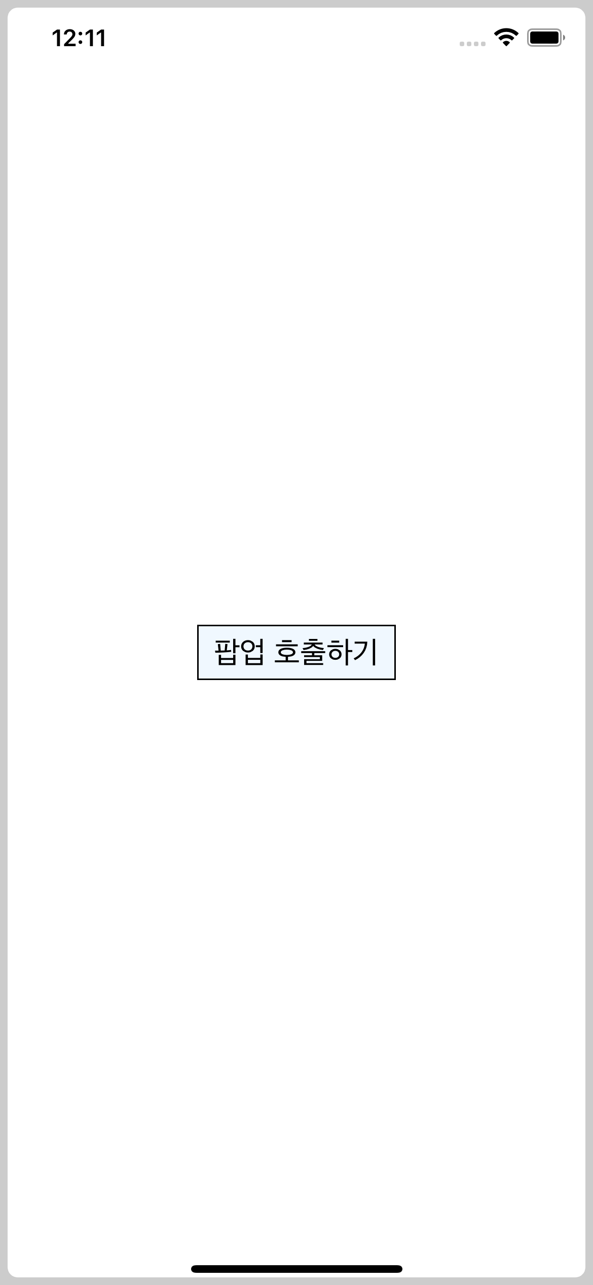
3. 팝업 사용하기
import React, {useRef} from 'react';
import styled from 'styled-components/native';
import Modal_Popup from '../Component/Modal_Popup';
const Container = styled.SafeAreaView`
  flex: 1;
  background-color: white;
`;
const ContentView = styled.View`
  flex: 1;
  justify-content: center;
  align-items: center;
`;
const Btn = styled.TouchableOpacity`
  padding: 5px 10px;
  border-width: 1px;
  background-color: aliceblue;
`;
const BtnText = styled.Text`
  font-size: 20px;
`;

const Home = () => {
  const popup = useRef();

  const clickBtn = () => {
    popup.current.visible('팝업 내용', '버튼 내용');
  };

  return (
    <Container>
      <ContentView>
        <Btn onPress={clickBtn}>
          <BtnText>{'팝업 호출하기'}</BtnText>
        </Btn>
      </ContentView>
      <Modal_Popup ref={popup} />
    </Container>
  );
};

export default Home;
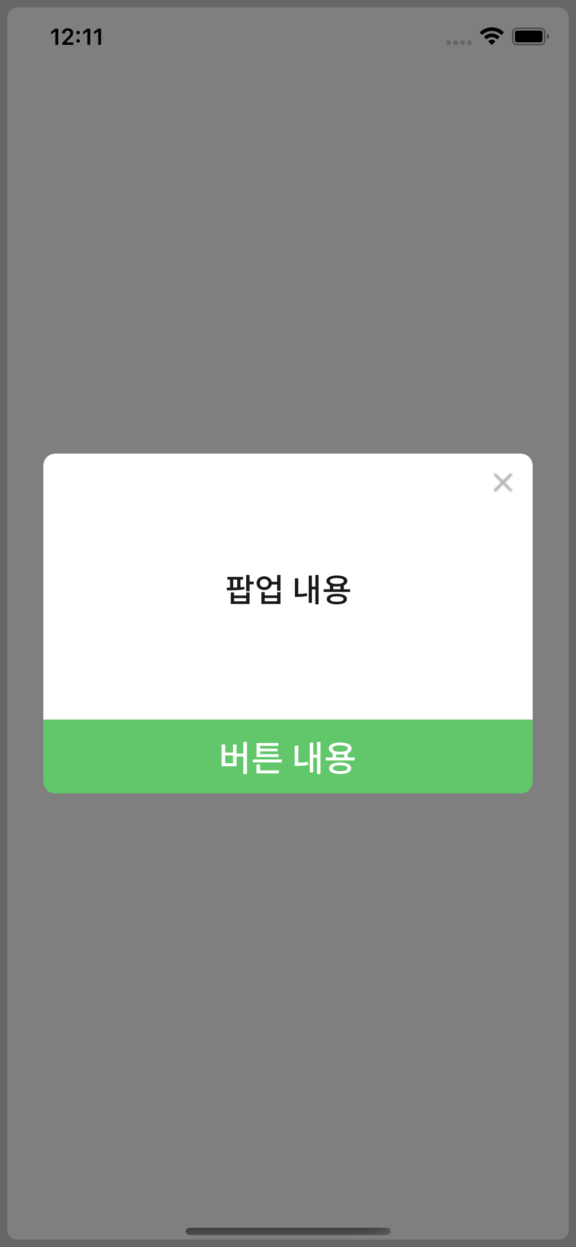
4. 결과
'React-native' 카테고리의 다른 글
| [ React Native ] AppState foreground, background 상태 알기 (0) | 2023.02.09 |
|---|---|
| [ React Native ] 앱 이름 바꾸기 (0) | 2023.01.30 |
| [ React Native ] 업데이트 팝업 만들기, 버전관리 (1) | 2023.01.27 |
| [ React Native ] Code Push 사용하기 (0) | 2023.01.19 |
| [ React Native ] [ iOS ] 소리가 나지 않는 문제 react-native-sound-player :: Sending "FinishedLoading" with no listeners registered. 경고 해결 (0) | 2023.01.19 |

